
Overview
Suwannee Valley Electric Cooperative (SVEC) needed assistance reigning in and better defining their brand elements.
The Problem
SVEC recognized the need for a brand realignment and clearer brand definition to strengthen its market presence. Although they had a strong logo and a selection of core colors, many elements of their visual identity—ranging from typography and iconography to photography—had become inconsistent over the years. This lack of cohesion resulted in a diluted brand image that failed to effectively communicate their values and mission. To enhance brand recognition and engagement, it was essential to unify these diverse elements and establish a more coherent visual identity that resonates with their audience.

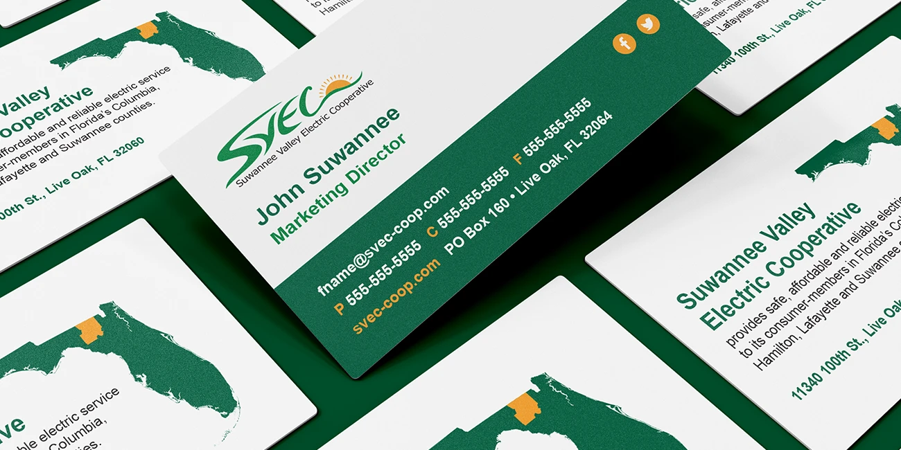
The Results of a Realigned Brand Definition
New Brand Opportunities for SVEC
Building on the organization’s established logo, A-Train Marketing supported SVEC’s brand definition by creating a fresh look and feel that enabled them to enforce consistency across the organization. Among the deliverables were:
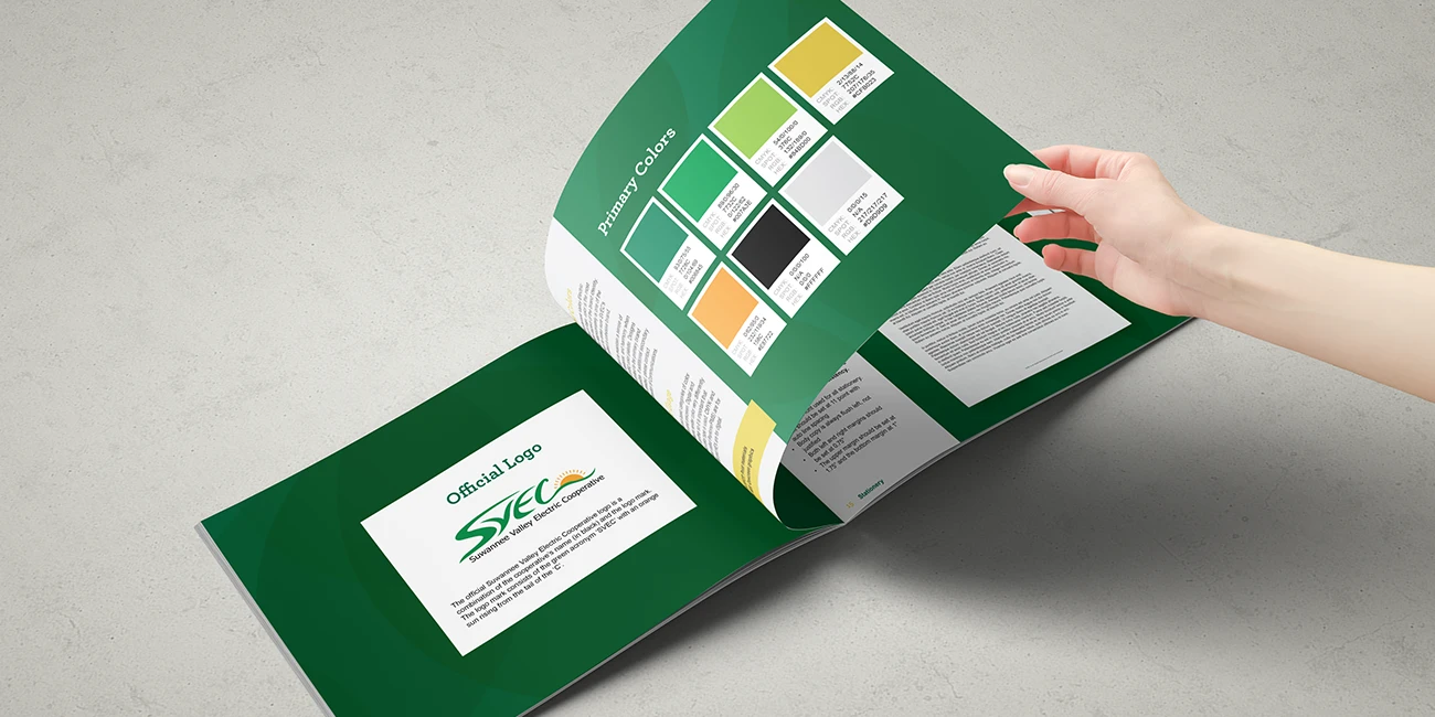
A comprehensive 10-page brand guideline
A full set of logo formats
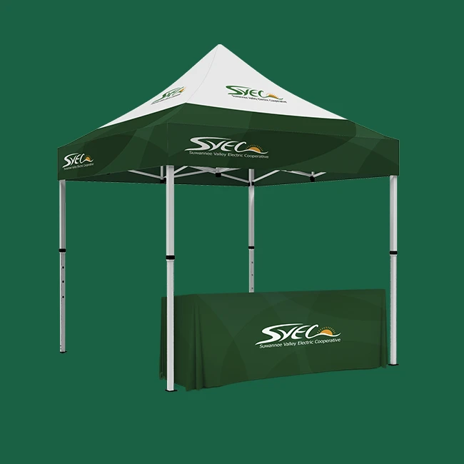
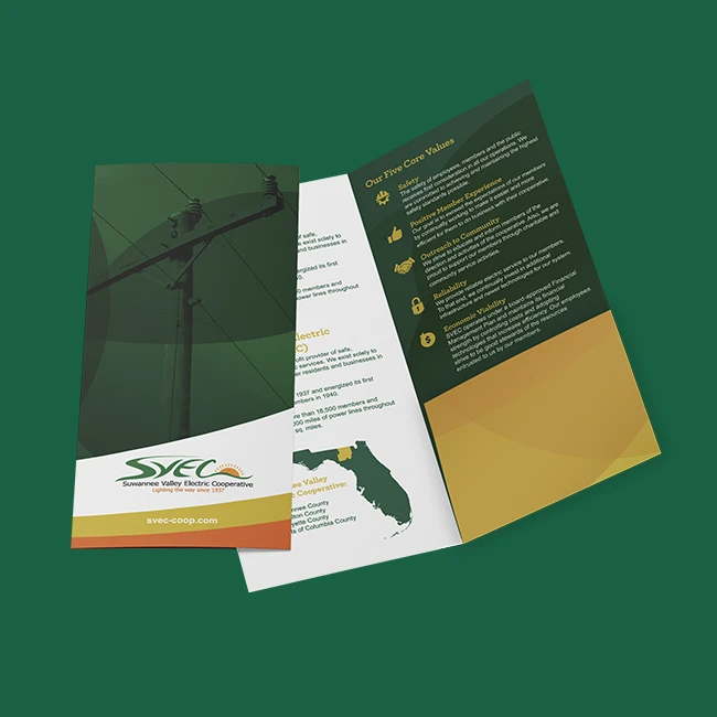
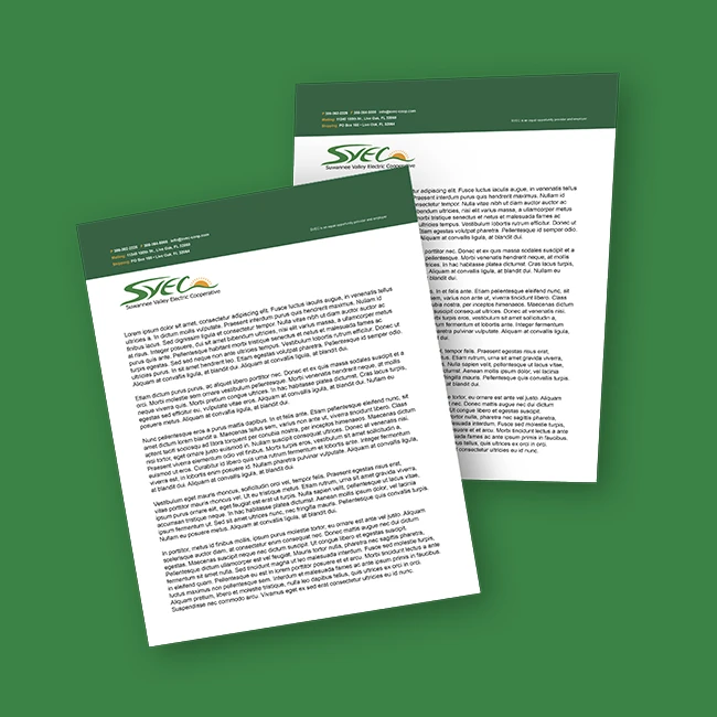
Initial launch of 6 brand assets