Overview
Platte River Power Authority (PRPA) turned to A-Train Marketing to breathe new life into its aging brand in a way that reflects its commitment to the region and respect for the environment.
The Problem
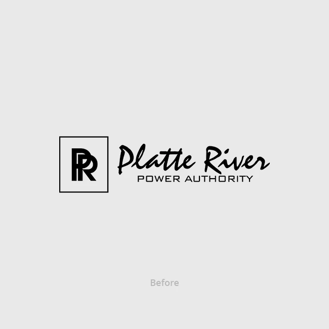
PRPA’s old logo had served it well but now looked dated and in need of a refresh. The organization also had never had a brand guide, a sense of cohesion and unity in its materials, or a modern web presence. A-Train Marketing went to work developing a new brand, a supporting brand guidelines document, and an updated website, ensuring the new look and feel will meet PRPA’s diverse needs going forward.
Developing an Eye-Catching Logo Based on an Iconic Image
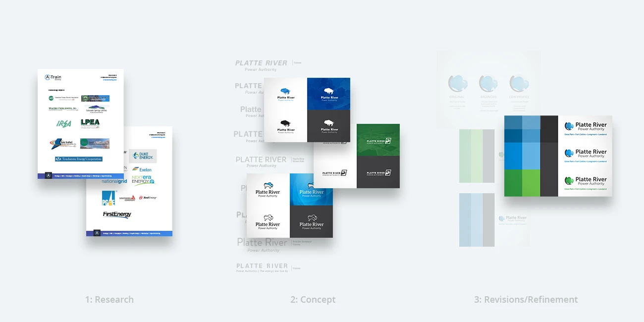
PRPA wanted its branding to be anchored by a strong, meaningful logo. To achieve that goal, A-Train Marketing researched competitors, created several concepts, and coordinated an extensive review process involving the organization’s executive team and board members. Ultimately, stakeholders chose an image representative of the Rocky Mountain west: the iconic American bison. PRPA cares for two bison herds that roam the expansive landscape around its Rawhide Energy Station and felt that the blue silhouette they selected speaks to the organization’s commitment to the region and connection to the environment.

Documenting and Implementing the New PRPA Brand
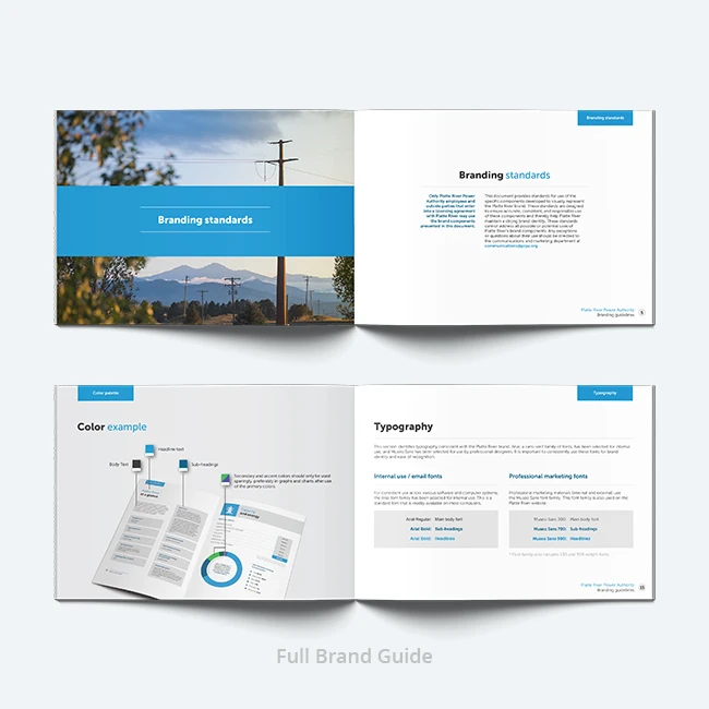
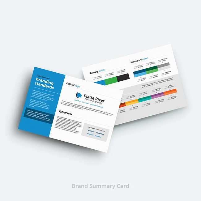
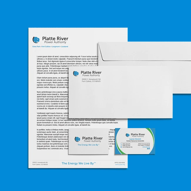
Once PRPA had selected its new logo, A-Train Marketing created a detailed brand guide, a small brand summary card, and various document templates. Those steps were the start of a new journey for the PRPA team, as they had not previously focused on maintaining a consistent visual aesthetic or “living” their brand.
Developing a Portfolio of Branded Materials
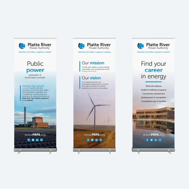
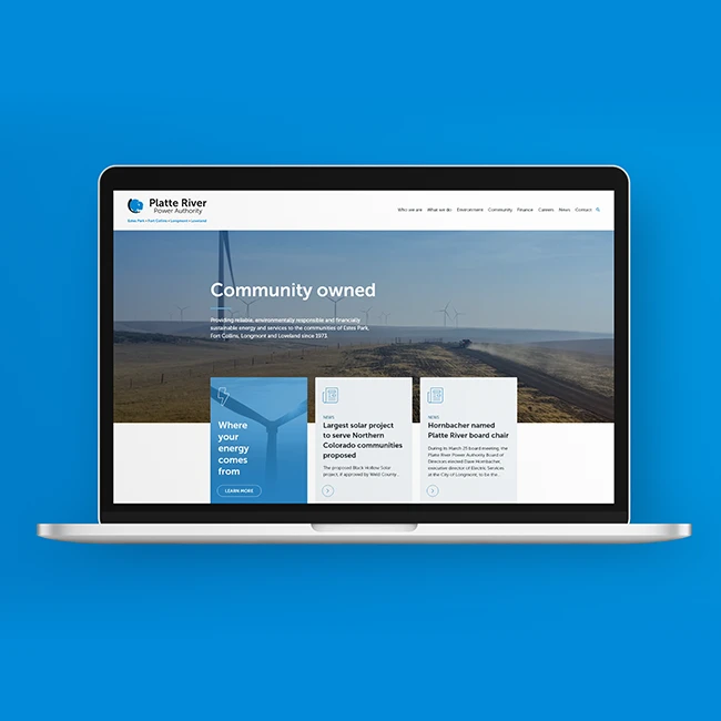
Knowing PRPA was thrilled with its new logo, document templates and brand guidelines, A-Train Marketing continued the project by updating the organization’s website and building out its brand assets, including everything from stationery to larger components, such as event materials, large-format printing, and digital media.

The Results
PRPA launched an updated, cohesive, beautiful brand that accurately reflects its values and dedication to environmental stewardship and fiscal responsibility. The new look, which earned high praise from PRPA’s owner communities of Estes Park, Longmont, Loveland, and Fort Collins, includes:
Logo, Brand Guide, and Brand Summary Card
Stationery
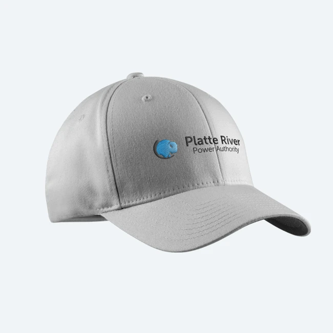
Branded Elements (Clothes, Table Tents, etc.)
Various Printed Materials for Several Departments (Retractable Displays, Flyers, Ads, and More)
Enhanced Website
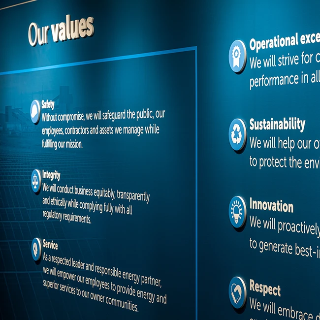
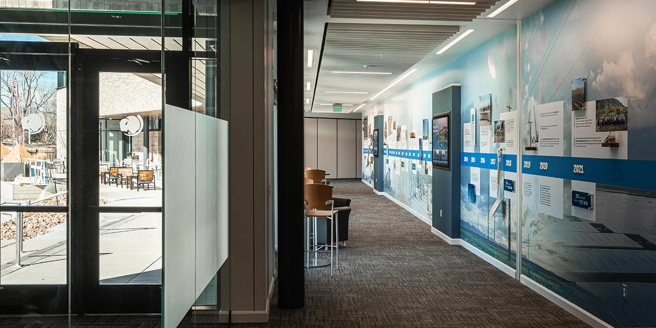
Headquarters Experiential Design Including Large Wall Graphics and Signage
