As our clients, colleagues, and many in our community know, each year A-Train puts out a valentine that is essentially a “love letter” to the people we have the pleasure of collaborating with throughout the year. The 2019 edition revolved around what’s called the Pantone Matching System, and how color, emotion, and marketing are all intertwined.
There are color “experts” who believe that having only seven “main” colors is too limiting. They feel that there are 12 main colors:
- 3 primary colors – Red, Blue, Yellow
- 3 secondary colors – Orange, Green, Violet
- 6 intermediate colors – Blue-Violet, Red-Violet, Red-Orange, Yellow-Orange, Yellow-Green, Blue-Green
Other color gurus take things even further, saying there are 16 key colors… but we’re not even going to go there!
Color and A-Train Marketing’s Character
Color is a central part of our world. It is integral to everything we do. So, how do A-Train’s values align with the color spectrum?
There are, of course, no right or wrong answers. But we thought we’d take a crack at pairing them up to give you a sense of what we care about and what drives us to do great work.
Here are the results:

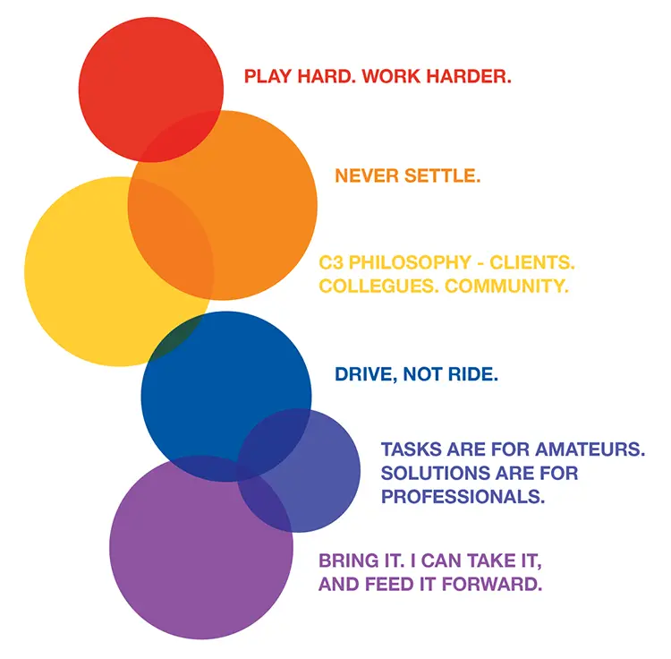
Play hard. Work harder.
We work hard, work fast, always strive to do high quality and error-free work, and do whatever it takes to get it done. Red pairs well here as it embodies boldness, excitement, and passion.
Never settle.
We have a desire to do more and to always do our best work. We reflect this in orange – for gentleness, freedom, and generosity.
Bring it. I can take it, and feed it forward.
We are willing to take responsibility for our actions and mistakes. We do not throw people under the bus. Violet works well here as it shows how we are fearless, yet full of imagination, and compassion.
Drive, not ride.
We are able to research and/or figure things out without too much hand-holding, but also know when/how to involve others for better ideas and results. We love blue for this value as it conveys trust, focus, and honesty.
Tasks are for amateurs. Solutions are for professionals.
We are conscientious, thoughtful, deliberate – we solve problems rather than complete tasks. Indigo represents our insight, creativity, and drive to solve problems.
c3 philosophy – clients. colleagues. community.
We bring a servant mentality to our work and relationships. Yellow represents our warmth, optimism, and grace.
And, since we have six company values and there are seven main colors, what’s left is: Green, for wealth, healing, and harmony… which is what we want everyone we work with to enjoy.
How’d we do? Have a better way to pair things up? Please let us know!


